Branding shapes the mood of a visit long before someone decides to click a button.
Users pick up signals from color, wording, spacing, and structure, and those cues influence how comfortable they feel moving from one step to the next. When those signals line up, people stay longer and interact more.
Optimized UX has been shown to boost visitor engagement by as much as 35%, and strong branding gives that lift a clearer path.
Plenty of teams polish interfaces without checking whether the brand behind them feels steady or recognizable. That gap creates small moments of hesitation that add up. When your brand voice, visual choices, and interaction patterns all point in the same direction, users move with fewer doubts and reach key actions with less effort.
This article breaks down how to align branding and UX in a practical, everyday way that supports real conversion gains.
Table of Contents
Lead with Clear, Helpful Guidance
Users respond well when a site gives them steady direction and answers their questions before confusion sets in.
This approach reduces cognitive load and builds trust, which often leads to stronger engagement and smoother conversion paths.
A helpful brand presence also encourages visitors to explore more pages, since they feel they’re learning something valuable instead of hunting for basics that should’ve been obvious from the start.
Here’s how to implement this tactic:
- Treat every key page as a chance to level-set expectations.
- Start with short, direct statements that explain the purpose of the page.
- Keep instructions visible instead of burying them behind secondary interactions.
- Use headings that tell visitors exactly what they’ll get when they scroll or click.
- Make your FAQ and support content easy to spot and even easier to navigate. Visitors shouldn’t wonder where information lives. They should reach it in a single, predictable step.
- Keep your language steady across pages so users don’t need to reorient themselves. Straightforward wording also helps reduce support requests because people understand what they can do and what happens next.
- Test pages with people outside your team. Ask them where they’d click first and what they think they’ll find. Their reactions highlight gaps you might’ve missed.
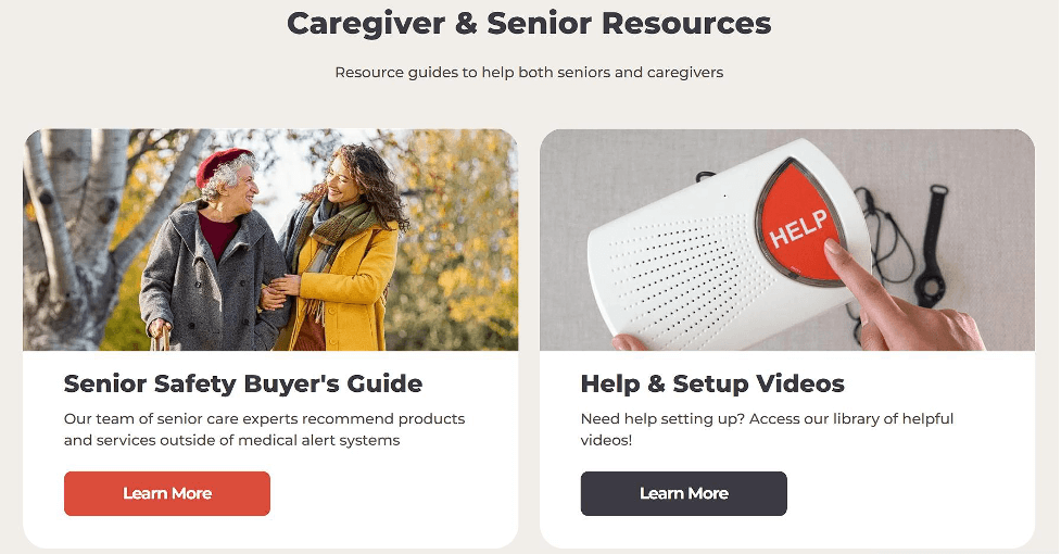
Bay Alarm Medical, a company known for its medical alert systems for older adults, follows this tactic closely. Their site uses wide spacing, short sentences, and minimal interface elements to keep stress low for a customer base that values clarity and calm pacing.
They also maintain an extensive FAQ section with direct explanations and a set of help guides that cover setup and essential tasks without forcing users through deep menus.
The experience feels guided and steady, which supports both trust and conversions.

Give Users Immediate Access to the Core Experience
People trust a product faster when they can try it right away. Instant access removes guesswork and lowers friction, which helps visitors understand the value of what you offer without extra steps.
This approach shortens the path between interest and action. It also signals that you stand behind your product and don’t need long explanations to justify its usefulness.
When visitors can interact with the key feature on arrival, they stay focused and engage with more intention.
Here’s how to implement this tactic:
- Select the feature users care about most.
- Bring it to the front of your layout instead of hiding it in secondary navigation or mid-page sections.
- Keep the interaction simple. If it’s a search function, let users start typing immediately. If it’s a tool or calculator, load it without gating it behind forms. The goal is to cut out early friction and let people experience value before they commit to anything else.
- Use clear labels so visitors know exactly what the feature does.
- Keep supporting text to a minimum.
- Monitor how far people scroll and how often they interact with the primary feature. If engagement is low, reconsider placement, clarity, or load speed. Small position shifts can make a measurable difference.
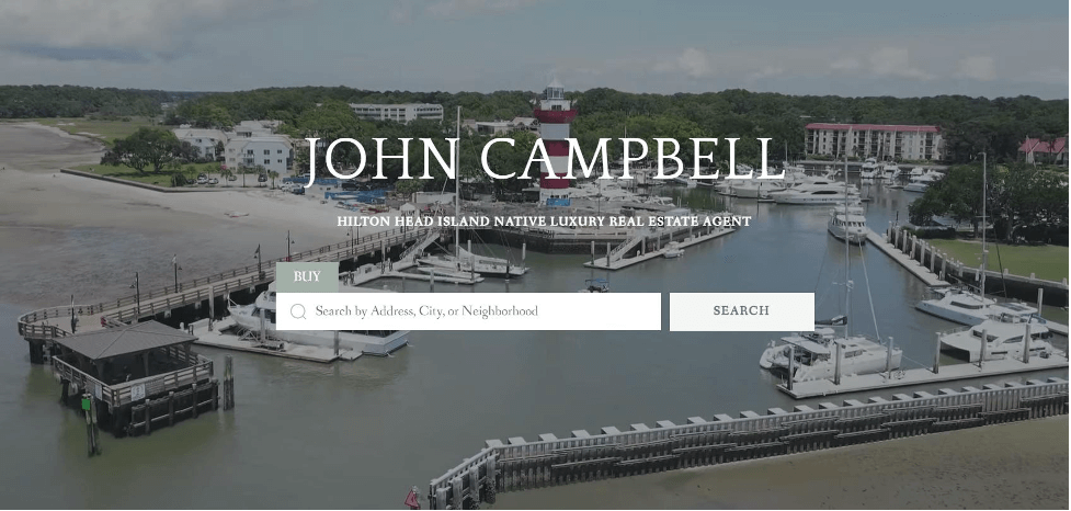
A strong example of this approach is on John Sells Hilton Head, a real estate professional whose site focuses on helping buyers explore available properties.
The main product (the property search tool) sits directly in the header. Visitors can start typing as soon as the page loads, without scanning menus or scrolling. This approach conveys confidence in the accuracy and appeal of the listings. It also gives users a sense of momentum from the first second of the visit. The experience feels direct and helpful, which often leads to deeper site exploration and stronger conversion signals.

Build Navigation That Mirrors What Your Brand Values Most
Navigation shapes how people understand your site’s priorities. When the structure matches what matters most to your users, they move with less hesitation and reach key actions faster.
This reduces decision fatigue and keeps people aligned with the parts of your offer that deliver the highest value.
Clear navigation also strengthens trust because visitors feel that you understand their goals and respect their time.
Here’s how to implement this tactic:
- Study the tasks users want to complete first.
- Place those paths at the top of your hierarchy.
- Limit the number of primary navigation items so no one needs to scan long lists to find basics.
- Use short labels that match the language people actually use when searching for your content or products.
- Make high-intent actions visible from any page, especially if your audience often arrives with a clear objective in mind.
- Test your navigation with real users and watch how they move.
- Look for hesitation points, especially on mobile.
- If certain paths collect more interactions, consider elevating them.
- Keep your search function reliable and fast, since it often becomes a shortcut for people who know exactly what they want.
A strong search experience reduces the need for complex menus and supports visitors who prefer direct inputs over browsing.
Sewing Parts Online, a retailer selling sewing machines and accessories, shows how effective this approach can be.
Their audience frequently lands with a specific product or part in mind, so they invest in an AI-powered search tool that predicts matches the moment someone starts typing. Instant results appear without loading a separate search page, giving users quick access to relevant items. This setup reflects their commitment to efficient, technology-driven support and helps customers complete tasks without unnecessary steps.

Shape CTAs Around What Visitors Want to Do Next
Clear calls to action help visitors move through your site with steady momentum. They work best when they match the intent someone has at each stage of the visit.
This matters because most people skim pages quickly, and studies show that about 90% of website visitors only read headlines and CTA text.
When those elements speak directly to what someone needs in the moment, more users reach the outcomes you want to support.
Here’s how to implement this tactic:
- Map the typical paths visitors take.
- Identify the moments when they’re still gathering information, the points when they’re comparing options, and the sections where they’re ready to act.
- Place CTAs that match those states of mind.
- Use short, direct wording.
- Make sure each CTA has one clear purpose. A learning-focused CTA should lead to educational content, not a sales-heavy page. A conversion-focused CTA should land on a simple, predictable checkout or signup flow.
- Avoid creating too many variations. A small set of consistent CTAs across the site helps people recognize key actions without stopping to decode new terms.
- Test CTA placement on mobile and desktop to confirm that the buttons stay visible without feeling crowded.
- Check analytics to see where users hesitate or backtrack, then adjust positioning or phrasing to create smoother movement.
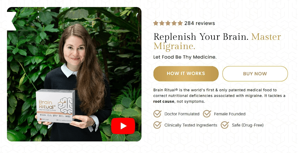
Brain Ritual, a company known for science-backed supplements that support brain health and help people manage migraines, uses this tactic with precision.
Their main header includes two CTAs placed directly beneath their value proposition. “How It Works” supports visitors who want clarity before deciding. “Buy Now” serves users who already trust the product and want immediate access.
This strategy respects different intent levels while keeping the experience simple and steady.

Show Proof That Your Brand Delivers Real Results
Credibility grows when visitors see clear evidence that your product works as promised.
Customers value the opinion of other customers much more than they trust advertising, so strong proof points help people make decisions with fewer doubts. They also reduce the time visitors spend questioning whether your claims reflect real outcomes.
When trust builds quickly, users move through the site with more certainty and reach conversion steps with less hesitation.
Here’s how to implement this tactic:
- Place proof elements across the site instead of hiding them on a single page.
- Add rating badges near key product sections.
- Keep them up to date so visitors see current performance.
- Share customer testimonials in short blocks with specific details about their experience.
- Use names and roles when possible to add clarity.
- Highlight recognizable clients or partners, but keep the layout clean so these elements don’t feel like decoration.
- Make sure every proof point supports a real question someone might have. If people often wonder how your product compares to alternatives, surface that information early. If they worry about onboarding or learning curves, include comments from users who had the same concerns. The goal is to address hesitation before the visitor needs to look for answers elsewhere.
- Review your analytics to find pages where users drop off and strengthen the credibility elements in those spots.
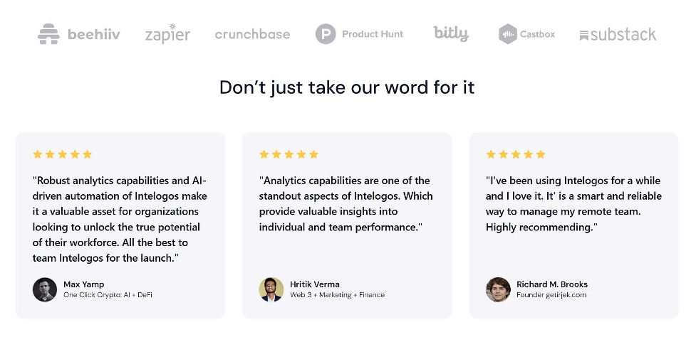
Intelogos, an employee monitoring and performance tracking platform, puts this tactic to work across their homepage.
They share ratings from third-party review sites to establish unbiased credibility. Plus, they showcase customer testimonials that speak to real results teams have seen. They also feature the logos of their most prominent clients to reinforce trust for first-time visitors.
These elements give users steady reassurance as they explore the product and decide whether it fits their needs.


Final Thoughts
Strong branding and strong UX work best when they support each other.
Every tactic in this article points to the same outcome: users move with more confidence when your site feels intentional, consistent, and easy to navigate. Clear guidance, instant access to core features, thoughtful navigation, steady CTAs, and visible proof all help visitors understand what you offer and why it matters.
These steps don’t require dramatic overhauls. They come from small, steady decisions that respect how people actually browse. When you treat branding as part of the user experience instead of a layer that sits on top of it, engagement rises, friction drops, and conversions follow naturally.
This mindset sets the foundation for a site that supports long-term growth.

